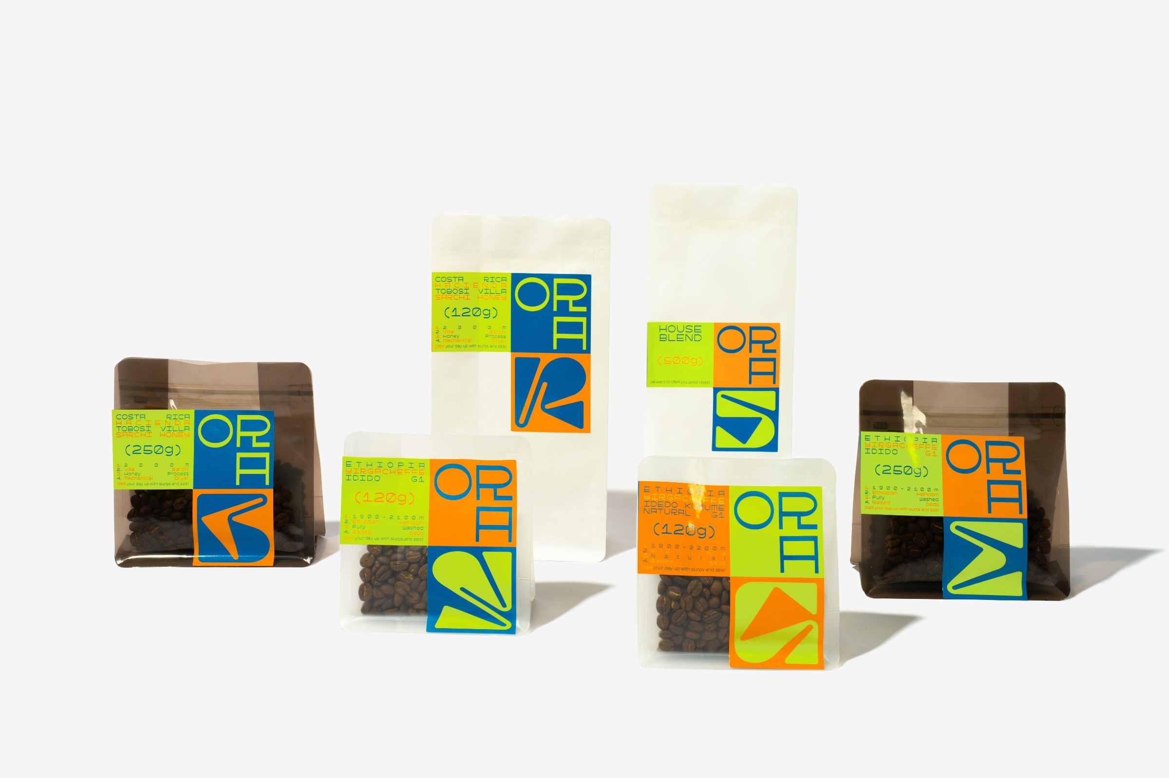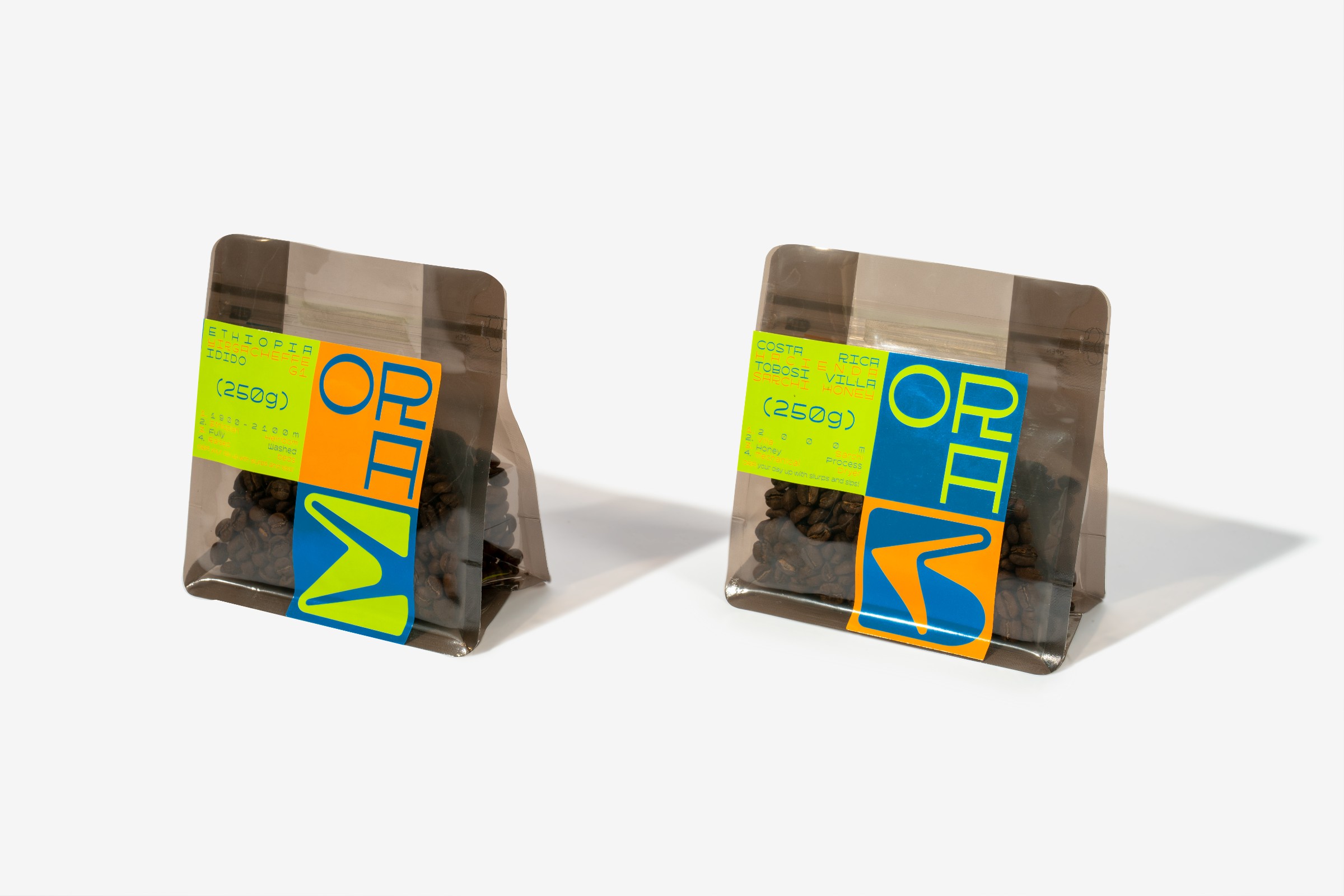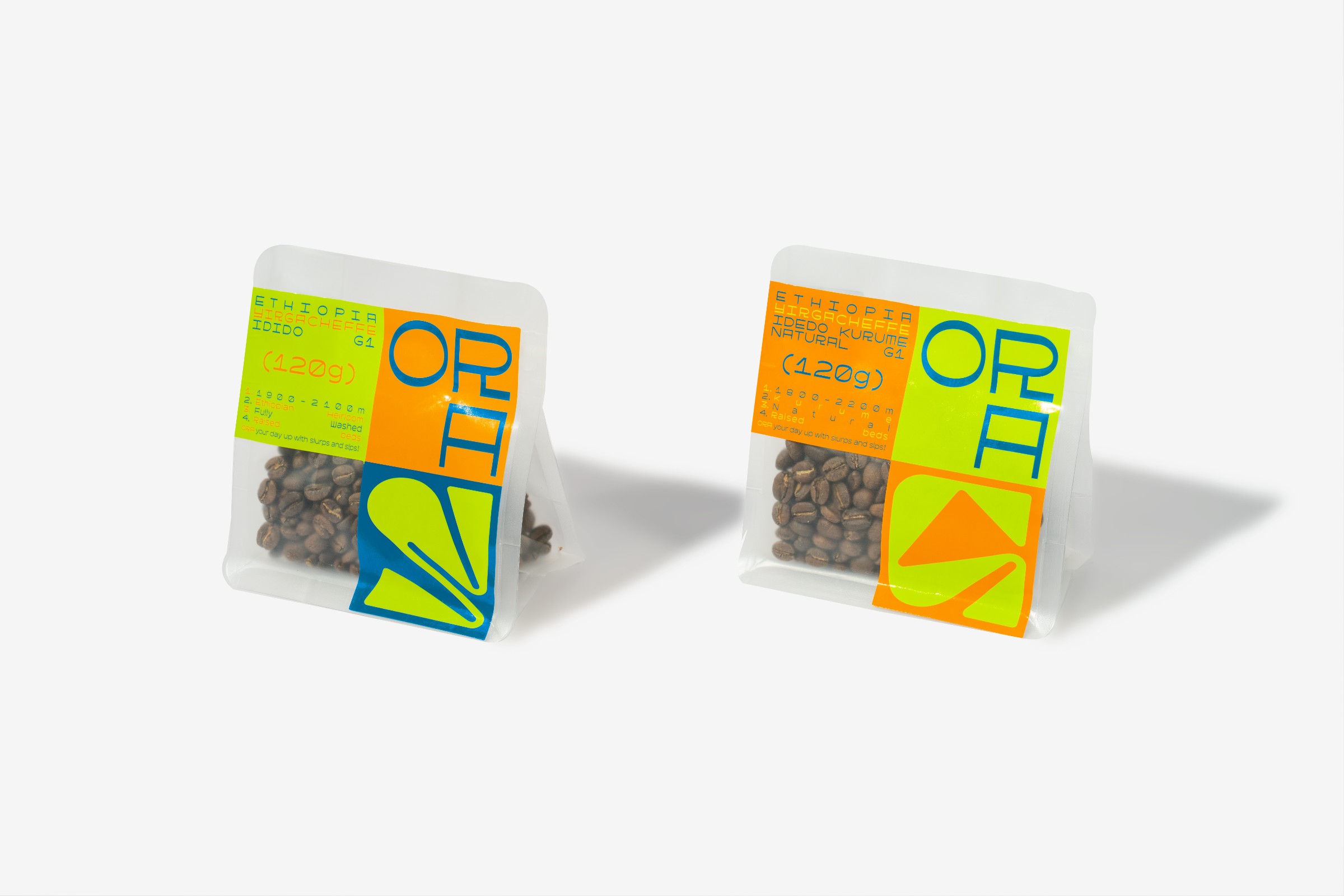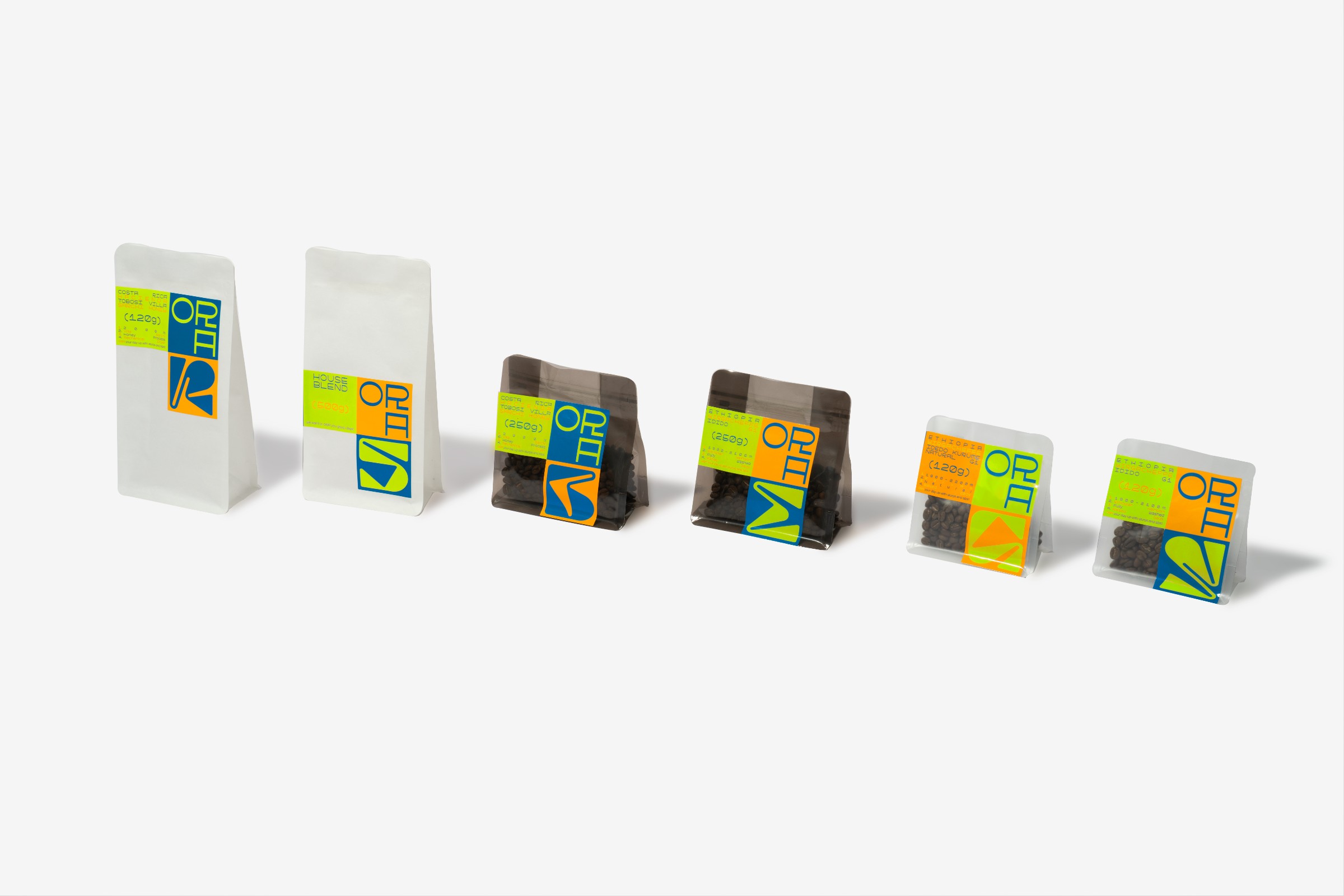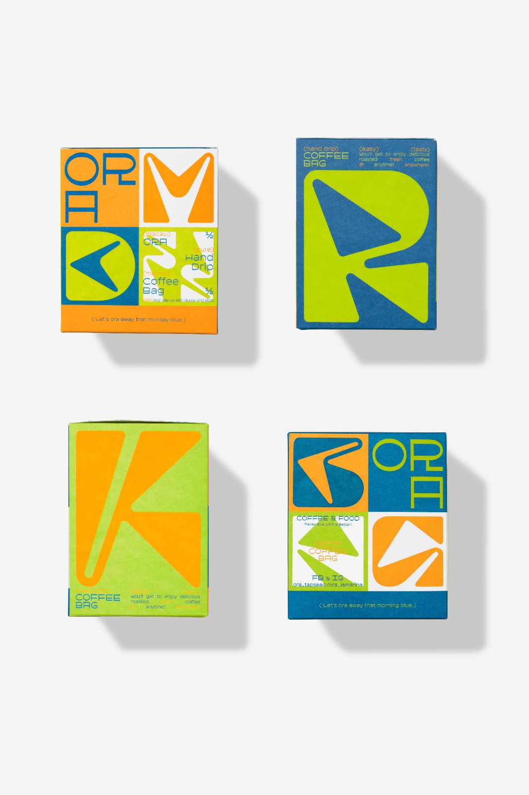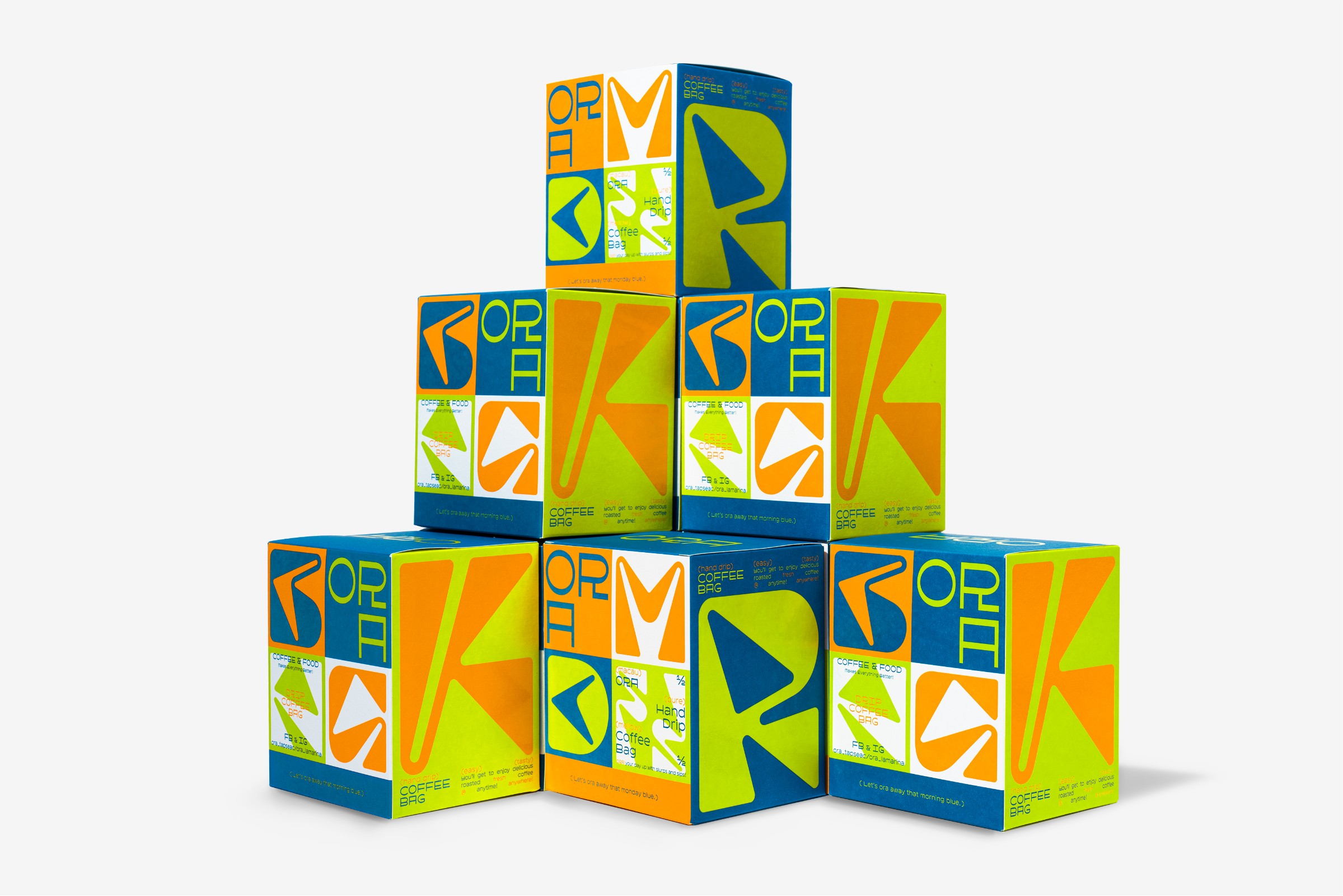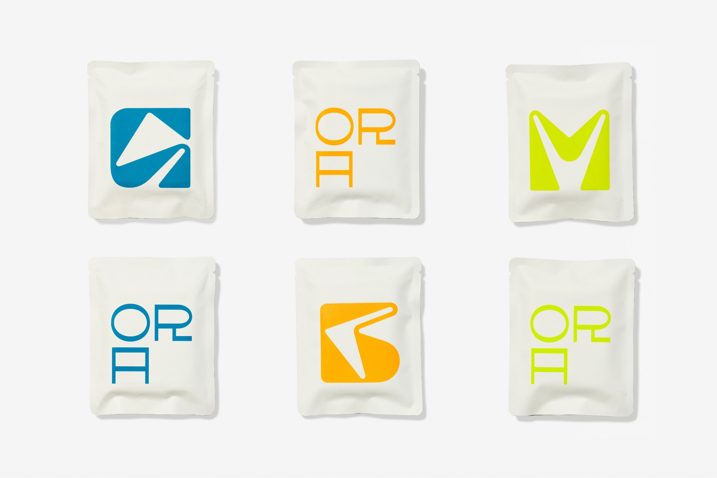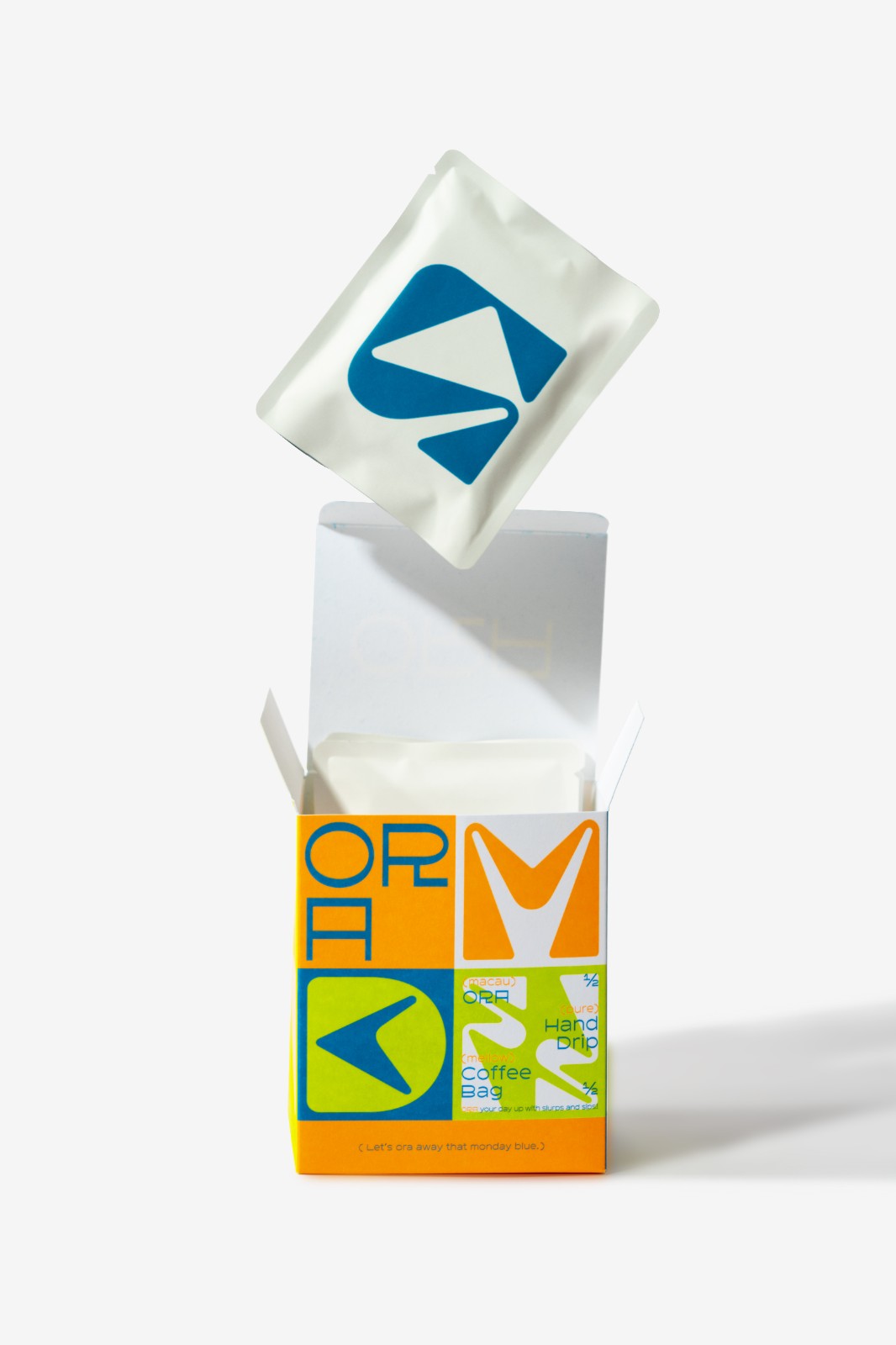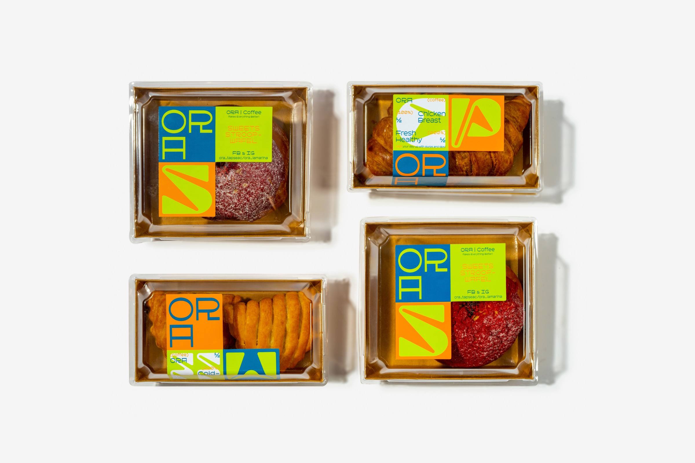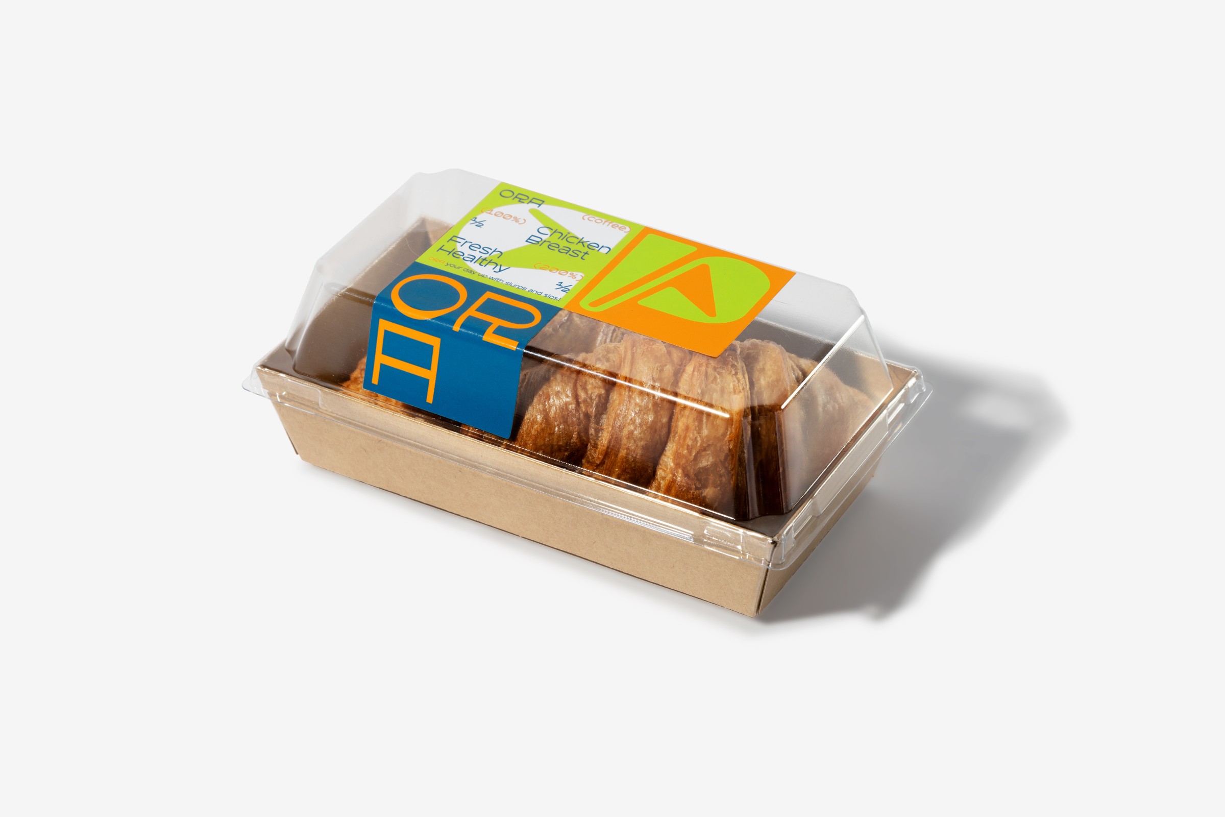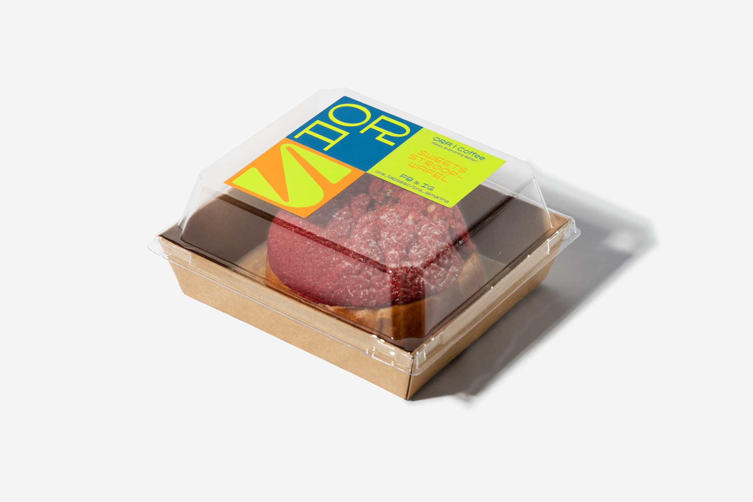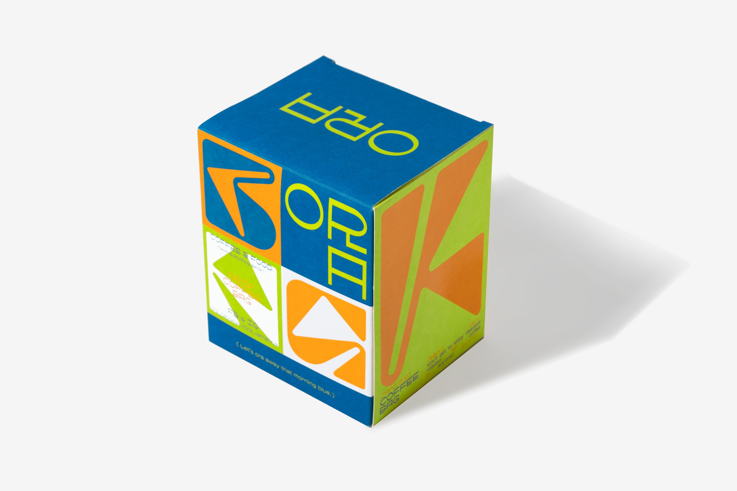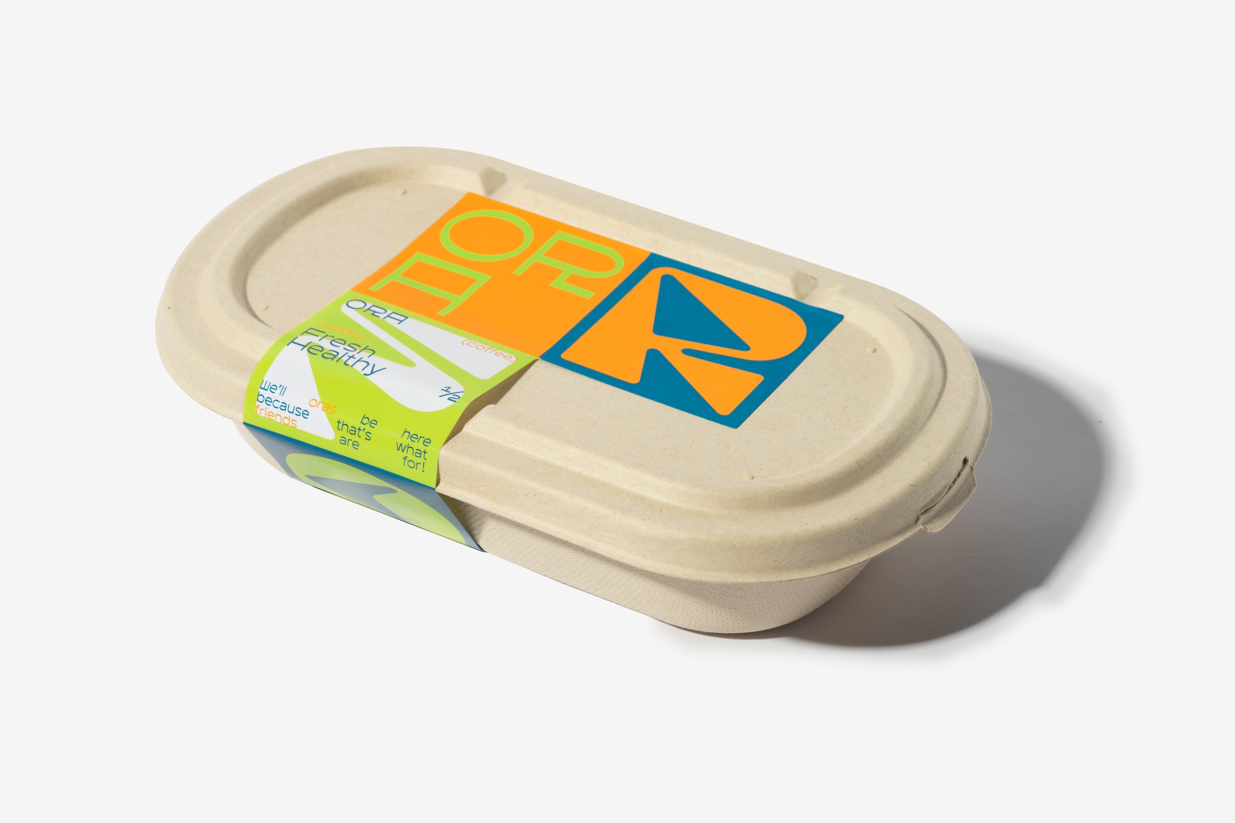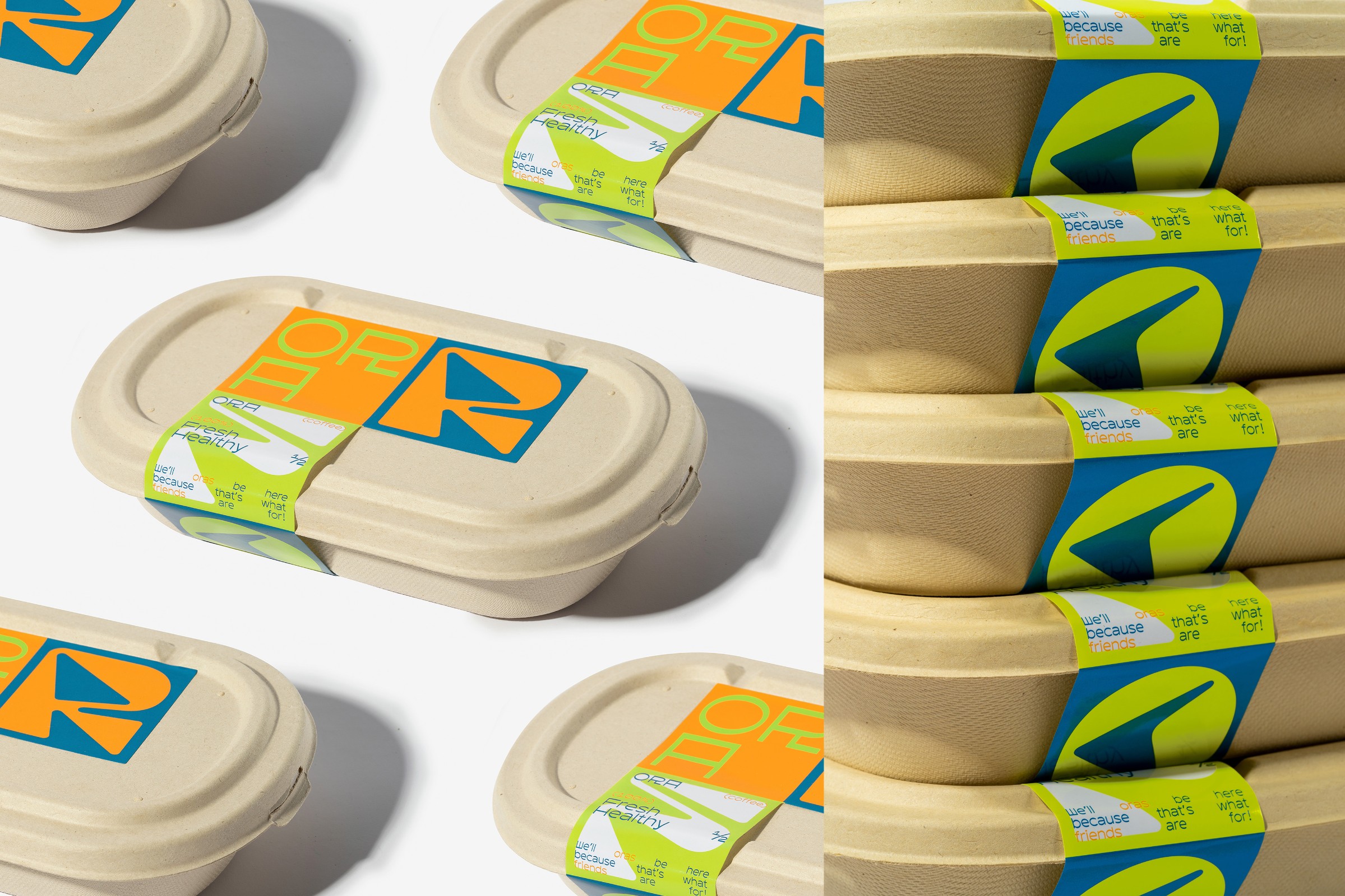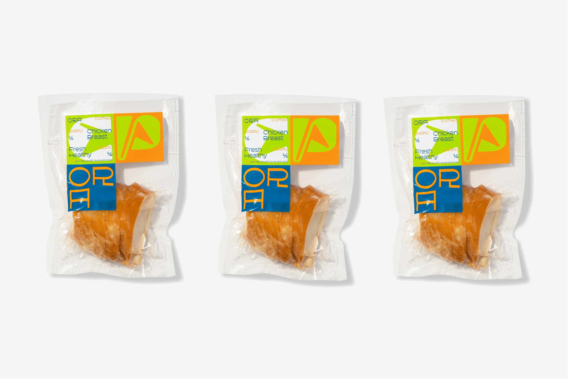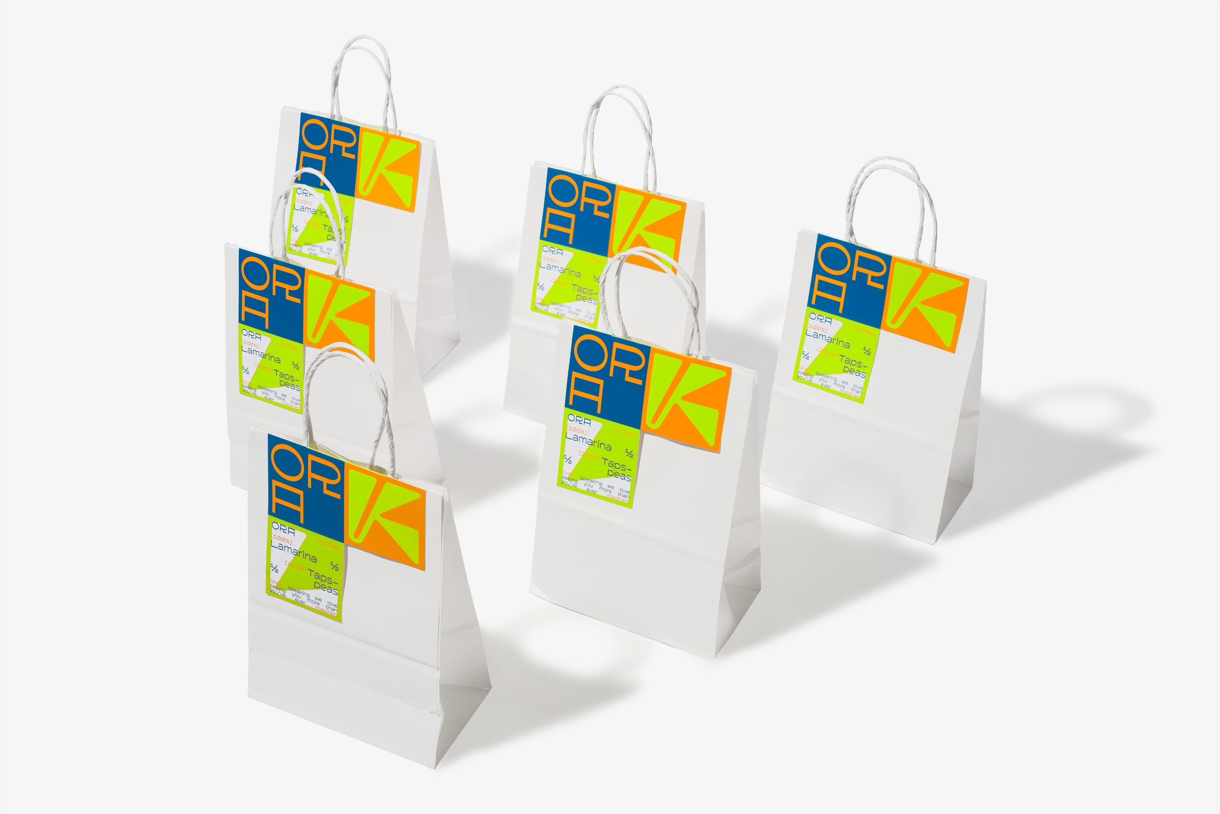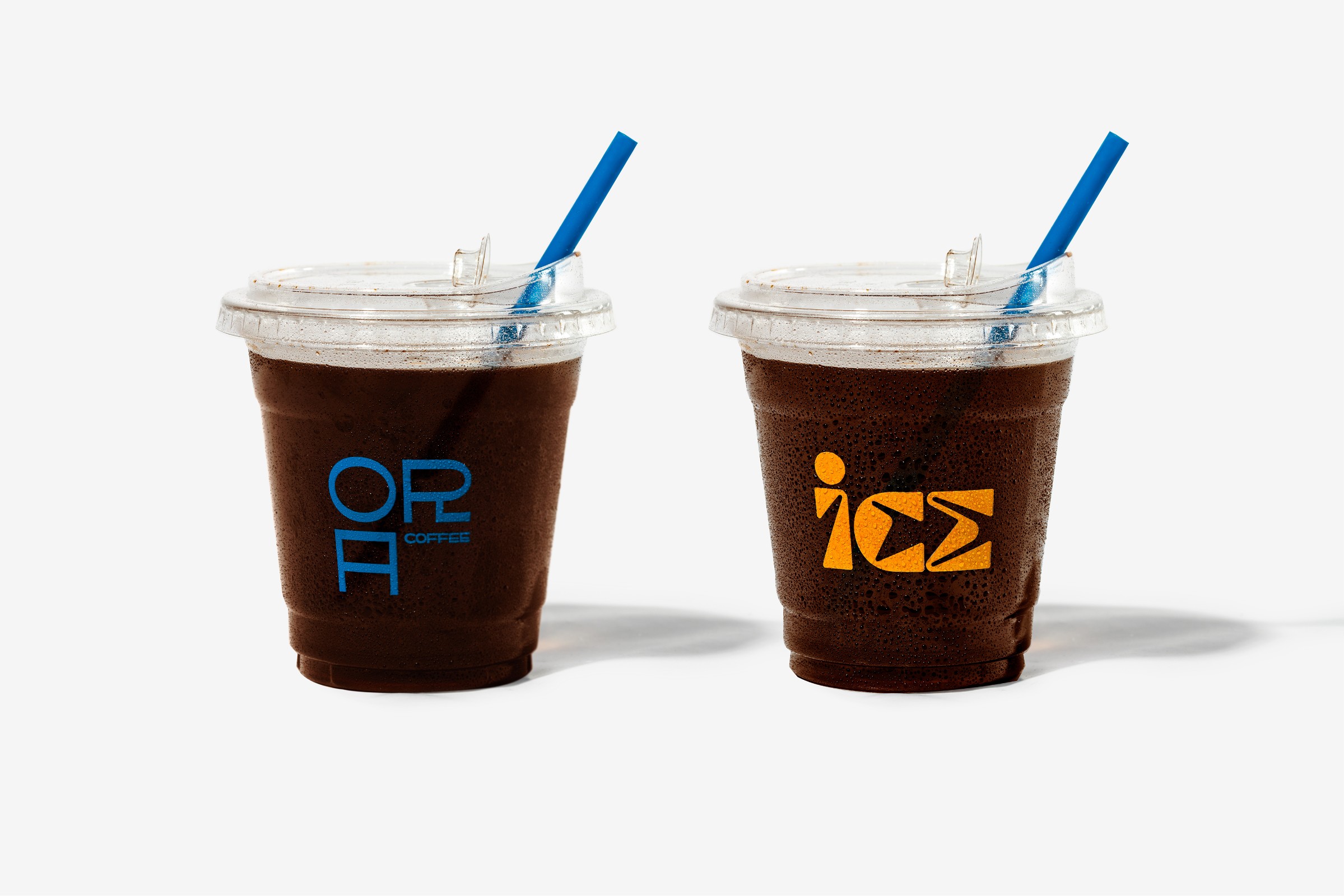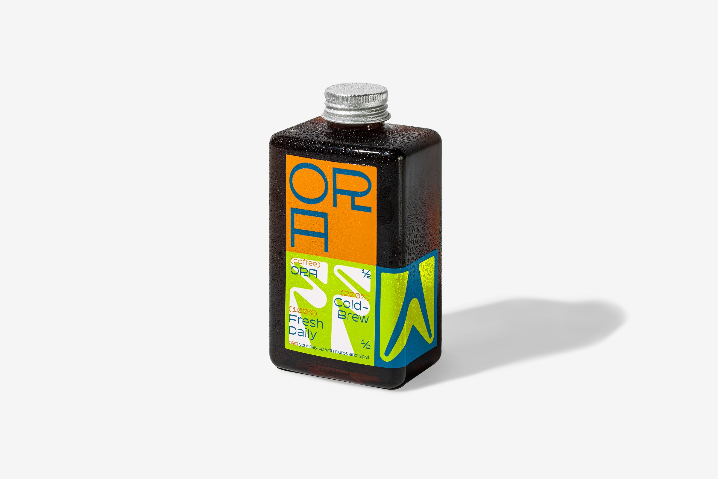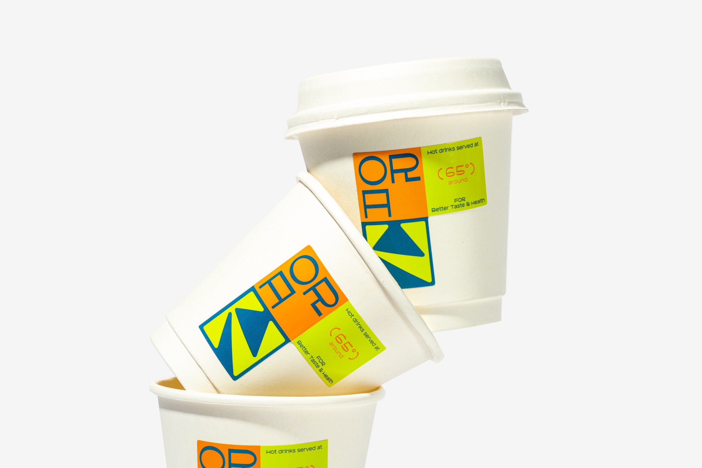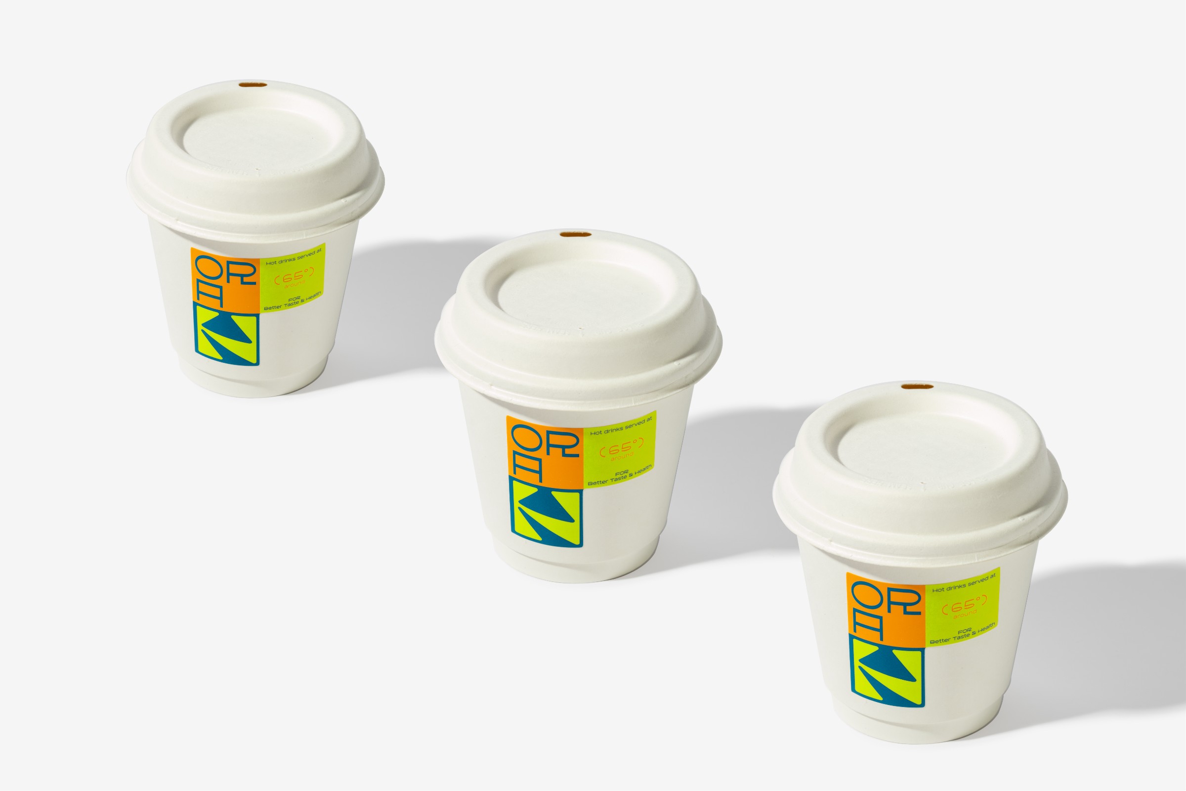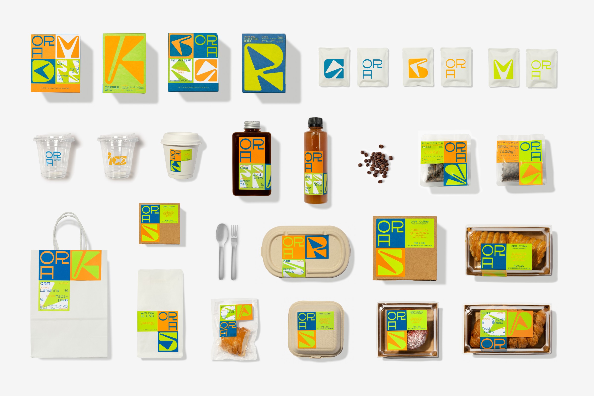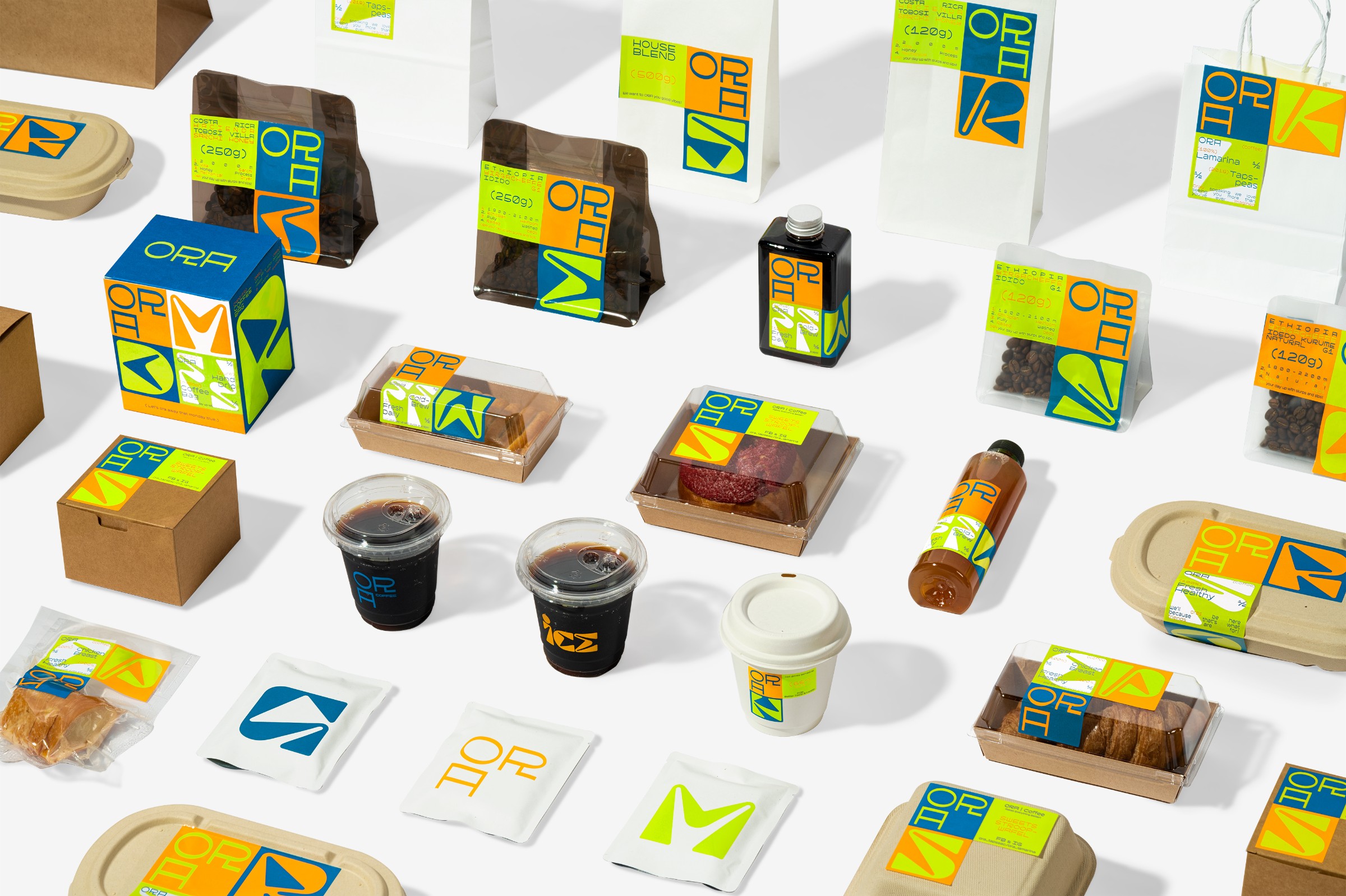
ORA is a renowned youth cultural hub in Macau that explores the connection between space and individuals while encouraging reflection on spiritual life. The brand is represented by three colored squares, symbolizing ORA, space, and people. To further shape its identity, ORA employs two contrasting typefaces—a structured block font that embodies the relationship between humans and their surroundings, and a dynamic script font that expresses passion and love for life.
| Client | ORA COFFEE |
| Year | 2022 |
| ART DIRECTOR | Kun Lam / Dan Ferreira |
| DESIGNER | Kun Lam / Dan Ferreira |
| PHOTOGRAPHY | Zero Yeung |
| Scope | Packaging design, Visual Identity |
ORA is a renowned youth cultural hub in Macau that explores the connection between space and individuals while encouraging reflection on spiritual life. The brand is represented by three colored squares, symbolizing ORA, space, and people. To further shape its identity, ORA employs two contrasting typefaces—a structured block font that embodies the relationship between humans and their surroundings, and a dynamic script font that expresses passion and love for life.